SparkCode Professional - Pie Charts

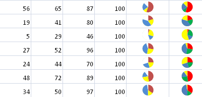
A Pie Chart is a circular graph divided into different areas, with each showing a relative percentage. SparkCode produces font-based Pie Charts with the aim of illustrating maximum amount of information in a relatively small area. The diagram below illustrates the use of a Pie Chart.
This following is the option dialog for Pie Charts. Each series of the numbers can be displayed in a unique color.

Empty Pie Color - The background color displayed when the Pie Chart is not completely filled up.
Range Colors
- Range 1 Color for Number Series 1
- Range 2 Color for Number Series 2
- Range 3 Color for Number Series 3
- Range 4 Color for Number Series 4
- Range 5 Color for Number Series 5
- Range 6 Color for Number Series 6